Case Study

Conexxia Website Redesign

From Outdated to Outstanding:
A One-Person redesign that transformed Conexxia’s Website for maximum impact

part one

Project overview

The client

Conexxia is a Sydney-based digital innovation company dedicated to helping businesses achieve better, faster, and more efficient outcomes through smart automation and rapid application development.

Duration

3 weeks from August 2024

Role

UI/Visual Designer Specialist

Tools

Responsabilities

Reviewing the existing website design and usability
Competitive Analysis
Wireframing & Prototyping
Visual Design & Branding
Content Strategy & Layout
Responsive Design
WIX Development
Launch & Post-launch Support

The Challenge

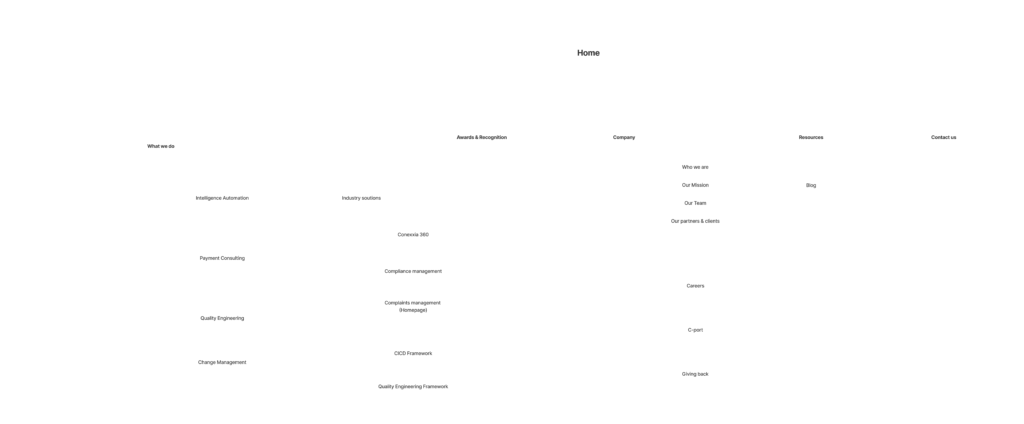
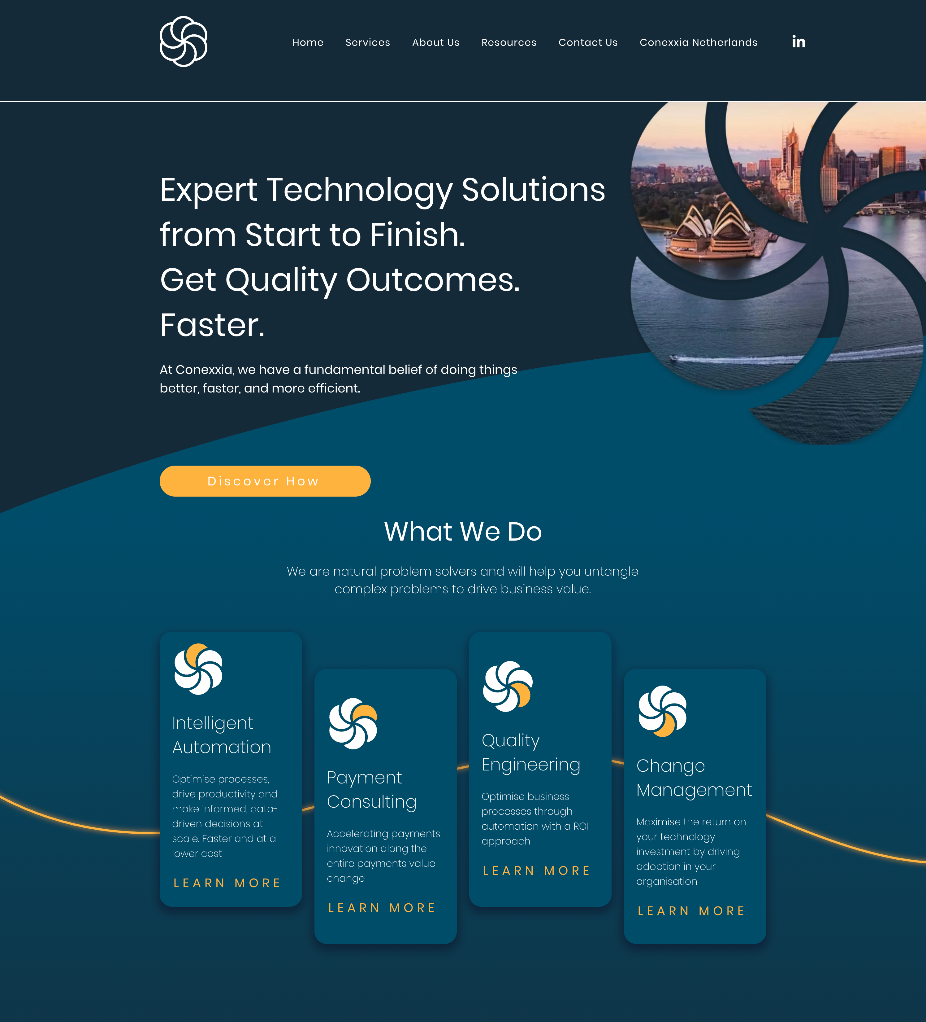
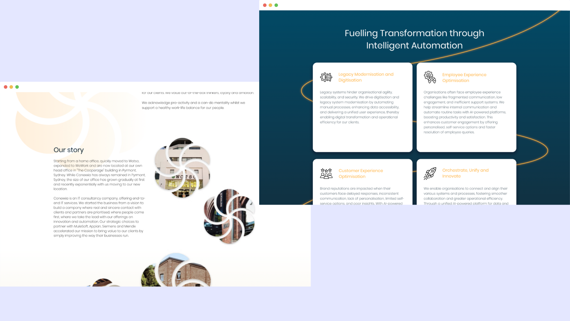
Conexxia’s existing website lacked the polish and professionalism expected from a company delivering expert technology solutions. Originally built without the input of a designer, the site was visually outdated, cluttered, and failed to communicate the company’s capabilities. The information architecture was chaotic, making it difficult for users to navigate or understand their offerings.

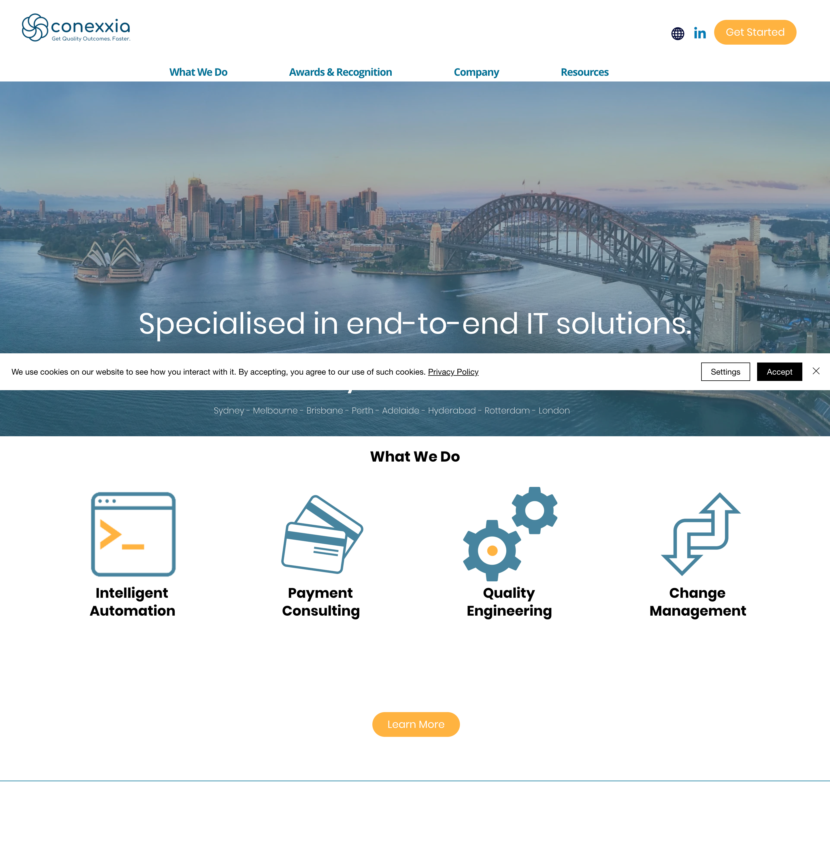
This starkly contradicted their brand promise—“Expert Technology Solutions from Start to Finish”—and created a disconnect between their high-quality service and their online presence.

As a result, even though Conexxia competed with major players like Accenture, they lacked confidence when presenting the site to clients. The internal employee page suffered from similar issues, further highlighting the need for a complete redesign.

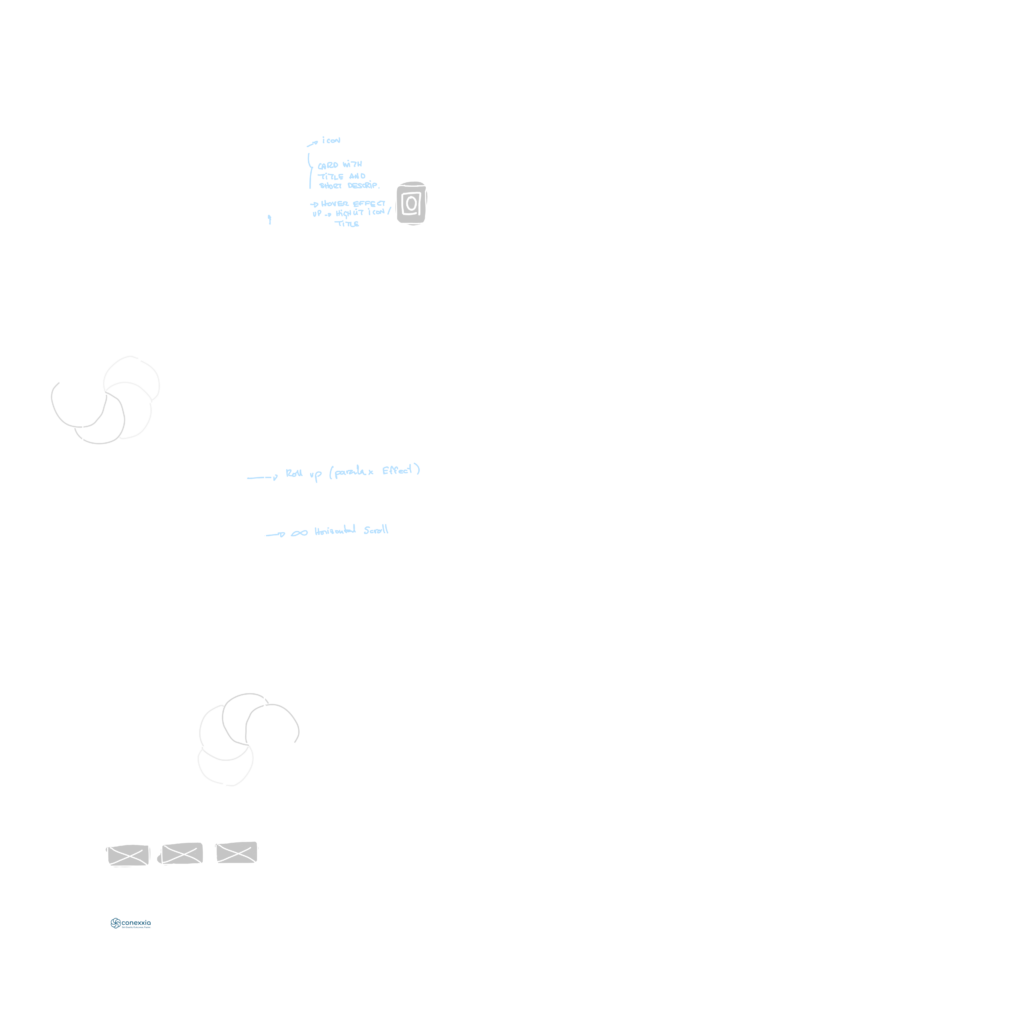
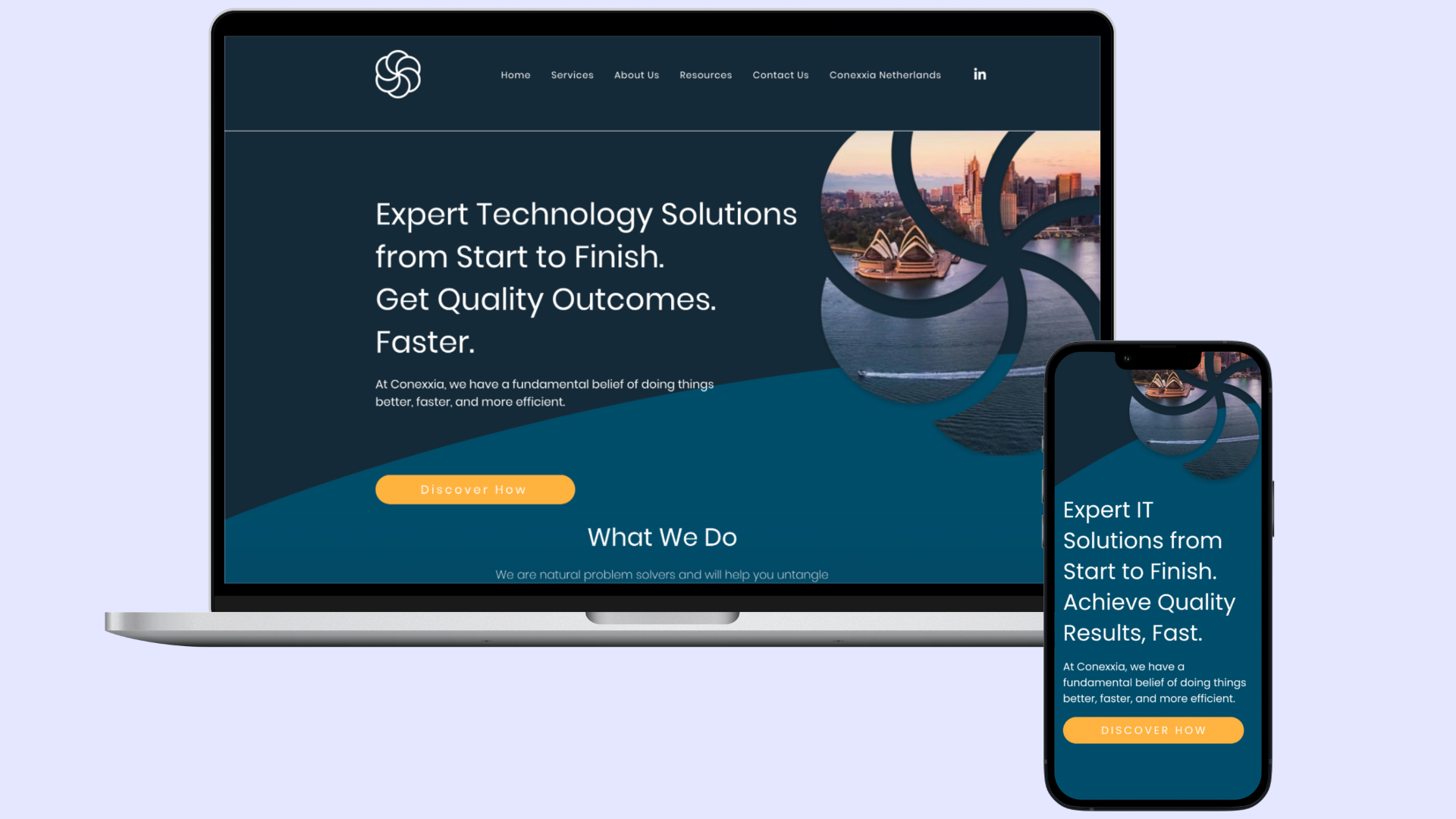
I was brought in as the solo designer with a tight three-week scope to design and build a new website in WIX (a platform that, while flexible, also introduced its own limitations in terms of customisation and performance).

part two

Starting the design

Low-fidelity wireframes

I began with Figjam. Utilising the whiteboard helped me brainstorm ideas, including various requests from the client. We envisioned the redesign as a link between the physical office and the digital website. The sitemap needed to be restructured to enhance usability.

part Three

Deliver

Conexxia Tile

RGB: 4, 72, 100

CMYK: 98.11, 28.3, 0, 58.43

HEX: #024C6A

Conexxia Blue

RGB: 21, 42, 56

CMYK: 62.5 , 25, 0, 78.04

HEX: #152A38

Conexxia Orange

RGB: 255, 179, 64

CMYK: 0, 29.8, 74.9, 0

HEX: #FFB340

The Result

Despite the tight three-week scope, I successfully redesigned and launched Conexxia’s main website pages on time and fully rebuilt in WIX. One of the most significant improvements was in the content structure, which was streamlined to remove unnecessary information, highlight what mattered most to users, and improve SEO. This gave the website a lighter, more breathable feel, enhancing both clarity and navigation.

The client was thrilled with the outcome, feeling that the new design truly reflected their professionalism and values. They reported a dramatic boost in confidence when presenting the website to clients and received overwhelmingly positive feedback from both internal stakeholders and customers. The redesigned site also became a valuable tool for the sales team, who now use the service pages during meetings with potential clients. Through thoughtful typographic hierarchy and a refined color palette built from their existing brand identity, the final result brought consistency, usability, and credibility to their digital presence.

Let's work together?