Case Study
Full Moon
A peaceful app for your
mental health and wellbeing
part one
Project overview
The product
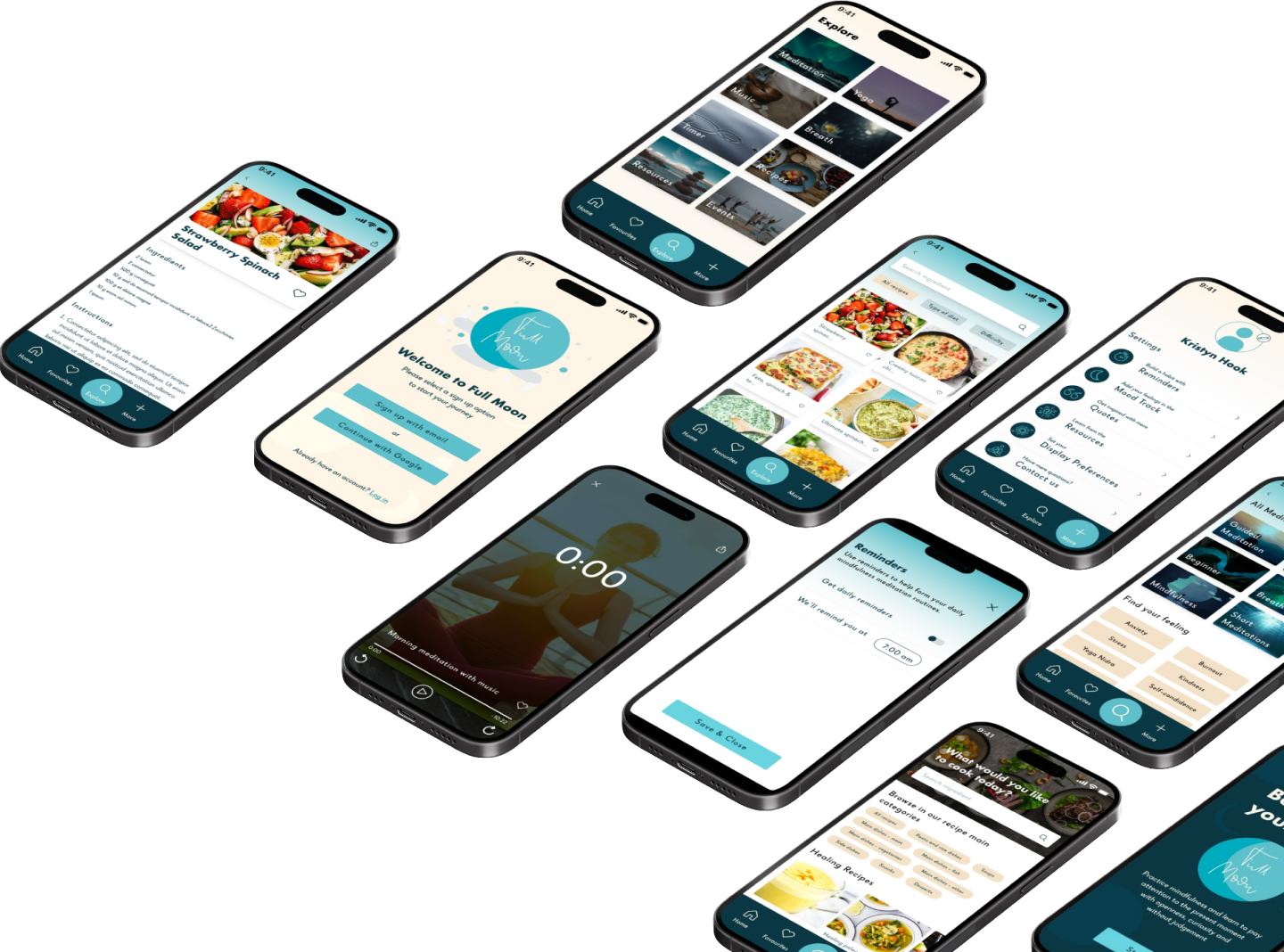
Full Moon is a mental health and well-being app. It covers a wide range of resources and features such as, meditations and topics related to mental health as well as healthy recipes and yoga to balance the body-mind.
Duration
7 months from May 2023
Role
UX/UI Designer for the Full Moon app from conception to delivery
Tools
Pen & paper
Figma & Figjam
Zoom
Responsabilities
Conducting a competitive audit
User research & interviews
Creating user personas
Defining user flows & information architecture
Paper and digital wireframing
Low and mid-fidelity prototyping
Conducting usability studies
Iterating on designs
The problem
Our mental health-conscious users need a way to access a mental health and wellbeing app to use physical, mental and emotional wellbeing features because that will allow them to be on top of their mental health, and learn new routines to achieve that goal.
Addressing the user needs
1
Making it easy to access wellbeing features.
2
Allow users to save their favourite meditations, recipes or resources to review them every time they need it.
3
Scheduling reminders.
4
Create a save an truthful app where users can feel supported and improving their general wellbeing.
The solution
Design a visually peaceful and calmness app to learn, practice and achieve a healthy state of mind a body through features that will help the users to be on top of their mental and physical health.
User sentiment
1
Managing time is complicated.
2
Users don’t really know where to start meditating and/or they know very little about the benefits and practices.
3
They look for personalisation and usability.
4
They don’t know how to establish routines to achieve their meditation, body exercise and good habits goals.
Desgin Process
Empathise
Define
Ideate
Prototype
Test
Desgin Process
Empathise
Define
Ideate
Prototype
Test
part two
Understanding the user
User research
To better understand what people know about meditation, mental health habits and mind-body balance and what to expect from a wellbeing and mental health app, I conducted interviews gathering insights that helped me to better understand the users opinions, feelings, experience and behaviour.
Addressing the user needs
User that meditate occasionally.
I don’t think an app can help me with stress.
A fitness user that use sport as stress realise.
I would like to have access to basic and simple resources.
User without knowledge about meditation.
User personas
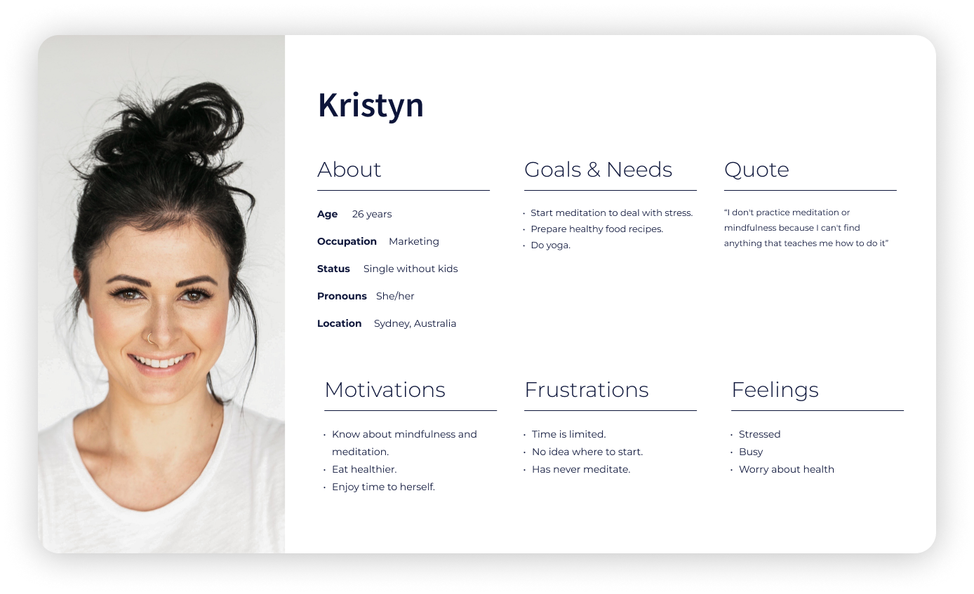
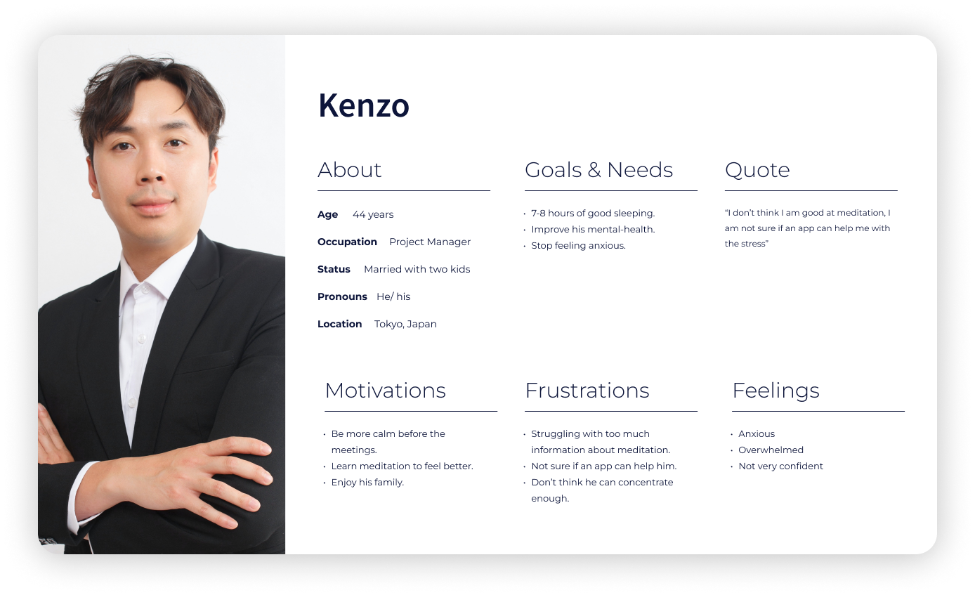
To develop the user personas, I was not only based on the insights from the interviews but in Cards for Humanity, which helped me to think more inclusively and get out of the box.
User persona 1
Kristyn leads a busy and stressful life due to her job’s demanding deadlines. She wants to incorporate meditation into her routine to manage stress, but she struggles with limited time and lacks guidance on how to get started. She also has a keen interest in healthy eating and seeks access to easy-to-follow recipes. Her primary goal is to achieve a sense of calm and balance in her life.
User persona 2
Kenzo has recently experienced increased anxiety due to a promotion at work. He is motivated to find ways to reduce stress, particularly before important meetings. Kenzo is open to exploring meditation as a means to improve his mental health, but he is unsure if an app can effectively assist him. He is seeking strategies to overcome information overload and improve his ability to concentrate. Kenzo’s main goals are to achieve better sleep, alleviate anxiety, and regain confidence.
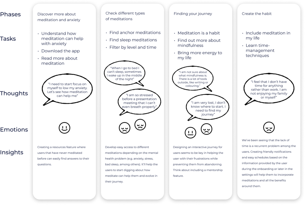
User journey map
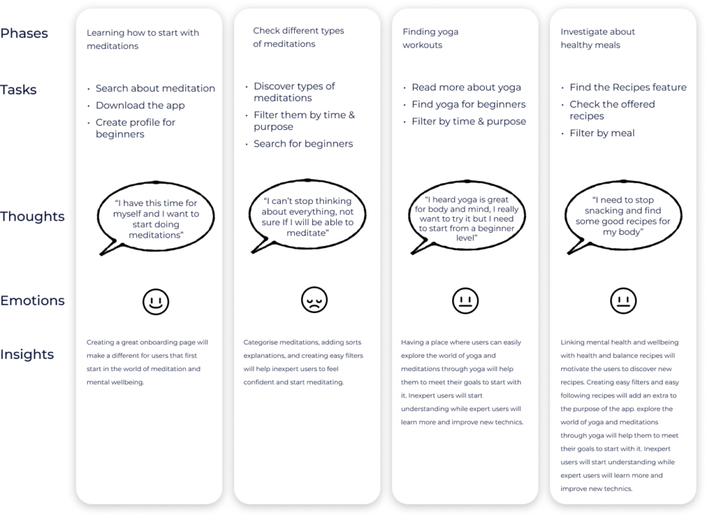
To develop the user journey maps, I focused on recognising the goal of my personas. I also referred back to my user interview data to find relevant snippets of conversation with the participants, trying to establish a truthful and believable narrative.
Scenario
Kristyn is taking a couple of days off to disconnect from his job. She wants to spend this free time to start doing meditations and enjoy herself.
Goals
- Reconnect with herself
- Meditate
- Cook healthy recipes
Scenario
Kenzo has planned with his partner to spend one hour, three days along the week to start learning about meditation to see if that help him with his anxiety and sleep.
Goals
- Decrease his anxiety
- Meditate
- Better sleep
User flows
To map the user flows I based on my personas and the tasks they would like to achieve based on their goals. I discovered what pages or screens the app should have, as a first approach.
Information architecture
To enhance the initial site map in alignment with insights obtained from user research, I opted for the open card sorting method. This approach aimed to validate the coherence and user-friendliness of the established categories.
part three
Starting the design
Low-fidelity wireframes
Full Moon is a mental health and well-being app. It covers a wide range of resources and features such as, meditations and topics related to mental health as well as healthy recipes and yoga to balance the body-mind.
Digital wireframes
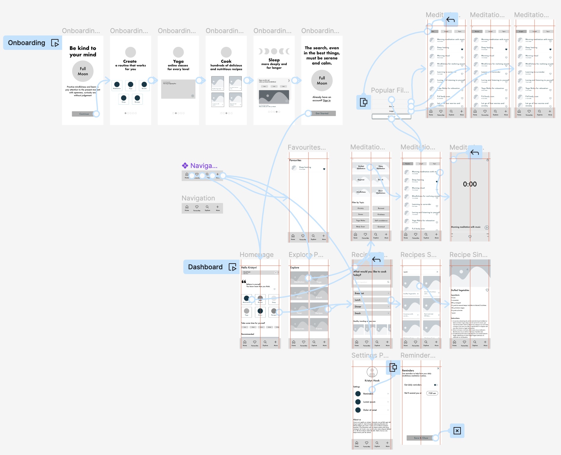
I built digital wireframes in Figma. To reduce the cognitive load for the users, I avoid unnecessary elements, I looked for design patterns and I eliminate tasks that weren’t necessary.
Low-fidelity Prototype
I confidently prepared an interactive low-fidelity prototype to conduct the first round of usability testing. The prototype effectively established key user flows including onboarding, starting a meditation, finding a recipe, and setting a reminder.
Usability study
The low-fidelity prototype was tested in a usability study, where users were tasked to complete the core tasks. Research insights were implemented into the next design iteration.
Study type
Moderate usability test study remotely and in-person
Location
Sydney, Australia
Sessions
30 minutes length
Participants
The study will test 6 participants
Insights
Onboarding Process
Onboarding Process
Dashboard
Dashboard
Topics & Labels
Topics & Labels
Mood Track
Mood Track
Filters
Onboarding Process
Affinity map
Affinity mapping is a powerful way that helped me to shift my perspective and distill a lot of information into key insights. I used a Rainbow spreadsheet to highlight the top 5 issues identified using the Jakob Nielsen scale.

part four
Refining the design
High fidelity prototype
The high-fidelity prototype showcases a streamlined core user flow that prioritises simplicity, user-friendliness, and swift navigation. During its development, I delved into interaction design principles, incorporating gestures and motion concepts to elevate the user experience, thereby enhancing overall usability.
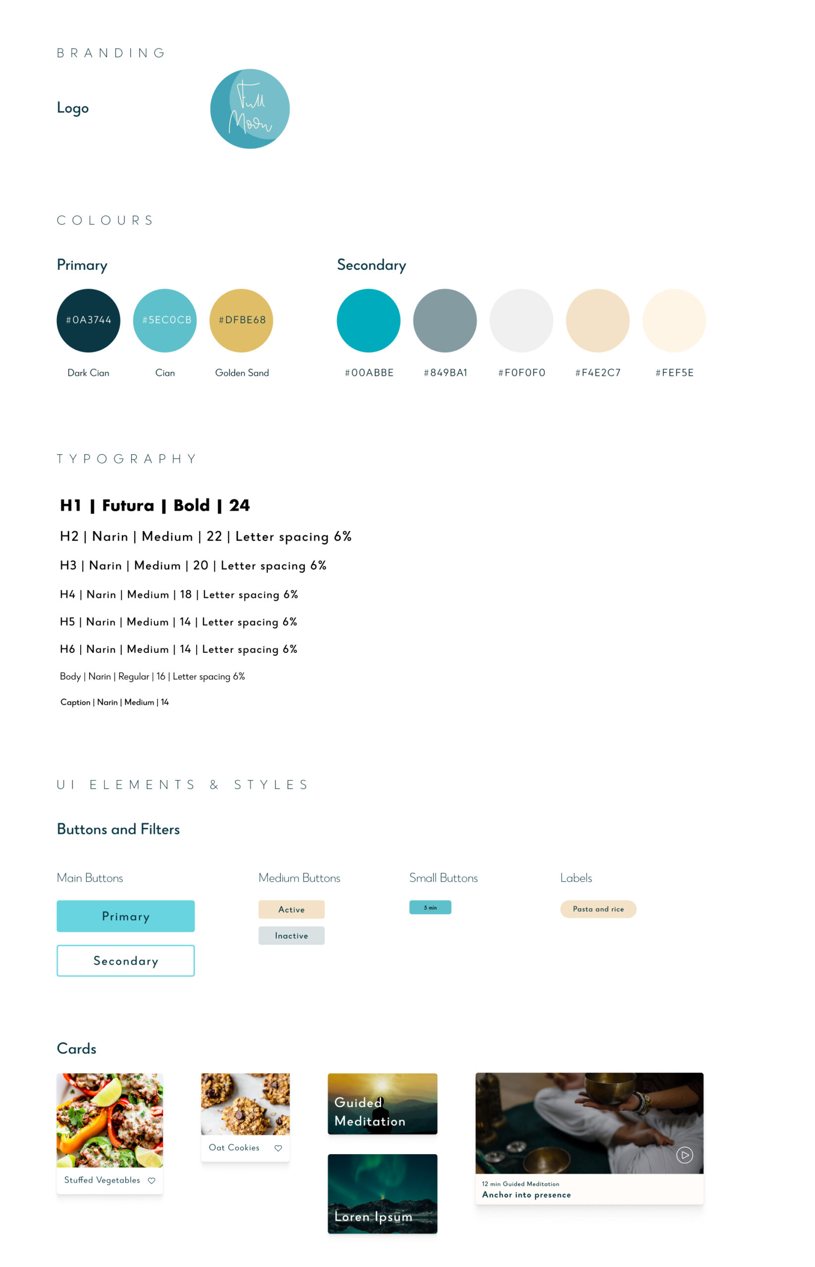
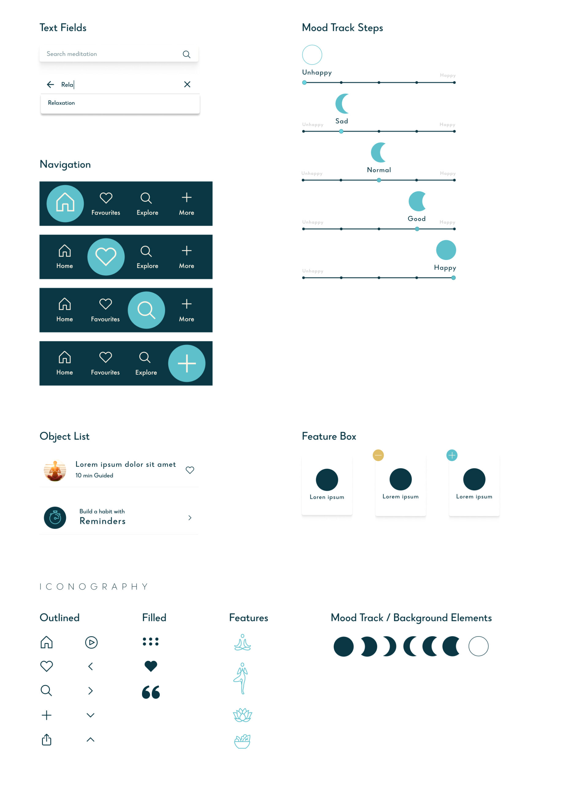
Design system
Defined specifications, including brand guidelines, visual aesthetics, and UI components, were established. This deliberate step aimed to maintain uniformity, strengthen brand recognition, and streamline the design workflow for greater efficiency.
Accessibility considerations
Incorporating accessibility considerations is vital to ensure equitable access and opportunities for individuals living with disabilities. Interestingly, products and features designed for people with disabilities often offer benefits that extend to a wider user base. By prioritising accessibility in design, I’ve been able to contemplate the diverse journeys of all users, accounting for various forms of disabilities, whether permanent, temporary, or situational.
Content size
I increased the text size significantly as the previous size was under 12 pixels which can be challenging to read for many users, especially older individuals or those with visual impairments. This change aims to enhance readability and ensure better accessibility for all users.
Cognitive load
I increased the text size within all content boxes and avoided using the character limit to display text in a single line, instead of that I made the full title visible breaking it down into two lines. This modification enhances user- friendliness by providing a more straightforward experience, preventing users from needing to decipher truncated content.
Colour contrast
I enhanced the contrast of the buttons by slightly increasing the brightness of the teal colour. This adjustment was made to improve visibility and accessibility for users. Having good colour contrast is essential for accessibility purposes as it helps users with visual impairments or colour deficiencies to distinguish between different elements on the screen more easily.
part five
Project retrospective
Challenges
- Grasping User Needs and Goals: Initially, deciphering user needs and desires can be challenging during the design inception phase.
- Prototyping for Diverse User Journeys: Designers must consider various user paths, not solely the ideal “happy path,” accommodating diverse user interactions.
- Importance of User Testing: Despite being a humbling experience, user testing remains pivotal for crafting a user-centric design.
Learnings
- Commence with Pen and Paper: Initiating the design process with pen and paper facilitates idea generation without delving into intricate details.
- Embrace Iteration: Consistent iteration is crucial; designers should frequently refine their prototypes and actively seek user feedback early in the design phase.
- Foster Humility: Designers should maintain openness to feedback and exhibit readiness to adapt designs based on insights gained from user testing.
Next steps
If I had more time, what else would I do?
Conduct another round of high-fidelity usability
Conducting another round of high-fidelity usability testing is essential to further refine the application’s usability. Specifically, incorporating more individuals with limited mobility and other disabilities enables a more inclusive testing environment.
Community for health
and wellbeing
Enabling users to connect with each other creates a supportive environment where they can share experiences, seek advice, and encourage one another on their health journeys. This feature not only enhances user engagement but also promotes a sense of belonging and accountability.
Handoff for Production
The handoff for production marks the transition from the design phase to the development and implementation stage.
A well-prepared handoff expedites the development process and ensures alignment between the envisioned design and the final product, ultimately contributing to the successful launch of the application.
